Videotron ad creative that people remember has three traits: the logo and hero visual are on screen from the first frame, the message fits in one line, and the whole thing works with the sound off. The fourth trait is the one most international campaigns miss: a separate file built for each screen's size and orientation, rather than one 16:9 master stretched across every site. This is how we review creative with clients before it goes live on 8infiniooh screens in Jakarta, from second-by-second structure to the technical checks.
Who is actually watching
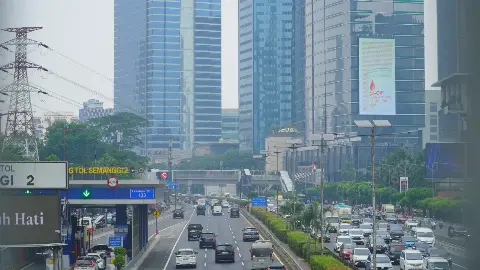
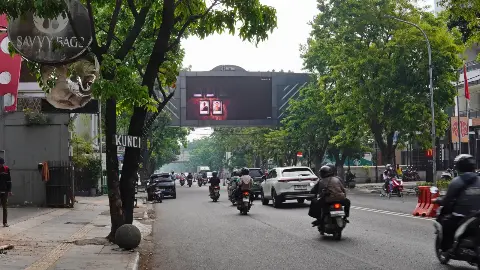
The audience for a videotron on Jalan Gatot Subroto or at Bundaran HI is not watching an ad. They are driving, riding pillion on an ojek, or waiting for a light to change. Their attention arrives as a glance and goes straight back to the road. There is no audio. And they almost never catch your spot from second zero, because your slot rotates in a loop with other advertisers.
That changes what good creative looks like. Teams used to social video tend to open slowly, hold the logo until the end, and run long supers that change quickly. All of that works on a phone held at reading distance. On a roadside LED, someone who looks up at second three still needs to know whose ad it is and what it offers.
A quick test we give clients: grab a frame at a random point, say second 4 or second 11. If that single frame does not tell you the brand and the main message, the edit needs another pass.
Structuring videotron ad creative second by second
Slot length is set at booking, and we cover how to choose it in our piece on videotron slot length and frequency. The question here is what goes inside that slot. A pattern that holds up on Jakarta roads:
| Part | What works | What we often see instead |
|---|---|---|
| Opening | Logo or pack shot visible immediately, strongest visual up front | Cinematic intro with no branding, fade up from black |
| Middle | One message, one short line, product stays on screen | Three or four claims cutting quickly |
| Close | A call to action people can remember without writing it down: product name, app name, store location | Long phone numbers, complex URLs, small-print terms |
Lead with the brand
A TV spot can build a story first because its audience is seated. On a videotron, the story never gets to finish. Lock the logo in a fixed corner for the full duration, or show the pack from frame one. For FMCG brands, a large product in the centre, the brand colour behind it and a single line of copy rarely fails.
One message per file
If the campaign brief carries three messages (a promotion, a new feature and a flavour launch), produce three files that rotate rather than one file that tries to say everything. Commuters who pass the same screen every morning will pick up a different message on different days, and each one stays clear.
A close that lives in memory
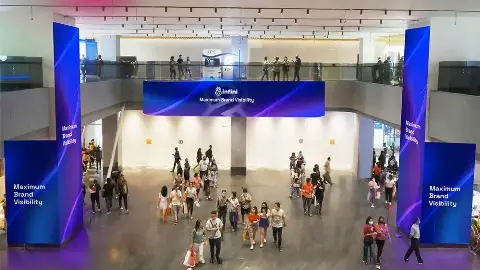
Nobody photographs a screen while driving. A realistic call to action is something people can recall later: "search in the app", a short hashtag, the name of a nearby outlet. QR codes still make sense on indoor mall screens and in pedestrian areas, but they do little on a screen facing fast-moving traffic.
One file will not fit every screen
This is the most common technical problem we see from regional and global agencies. Our screens vary a lot in size and shape, and a file that looks right on one site gets cropped or shrinks to illegibility on another. A few examples from the inventory:
- LED Mandarin on the Mandarin Oriental Hotel, facing Bundaran HI: three sides, with two wide faces of 27 x 9 m and an upright centre face of 8 x 16 m.
- LED Senopati, 8 x 4 m, facing towards SCBD.
- LED Dukuh Atas, 7 x 14 m, facing traffic on Jl. Jend. Sudirman heading to Senayan.
- LED Slipi on Jl. Letjen S. Parman, 9 x 18 m, facing towards Semanggi.
- LED JLNT Satrio A and B, 2 x 4 m each, facing Kota Kasablanka and Tanah Abang respectively.
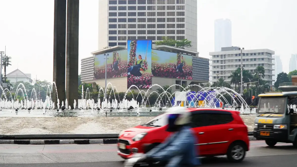
A 2 x 4 m screen on the JLNT Satrio flyover needs far fewer words and heavier type than a large screen on Gatot Subroto, even when the message is identical. On a three-sided screen like Mandarin, creative can be designed as one continuous composition that wraps across the faces, or as three panels that work together. The cover photo on this page shows the second approach: one visual split into an upright centre face and two wide side faces. You can see more on the format on our Robotic LED at Bundaran HI page.
An example from our sites: Samsung's S24 campaign ran on LED Mandarin and also on LED Senopati, two very different formats, one a large three-sided screen and the other a single 8 x 4 m face. For multi-site plans like this we ask for every screen's spec sheet to go to the creative team at kick-off, so each cut-down is planned, not improvised the day before the flight starts.
Type, colour and motion on an LED face
Type
Limit the number of words on screen at any one moment. Our rule of thumb: if a line needs reading twice, it is too long. Use heavy, simple letterforms and avoid thin weights, scripts and fine serifs, which blur into each other on LED at distance. Put promo numbers in large type and hold them for a few seconds instead of flashing them past.
Colour and contrast
Contrast between copy and background matters more than a refined palette. White text over a busy product shot usually disappears, so give copy a solid colour block. The same screen is seen in harsh midday sun and at night: very dark creative looks washed out by day, while a full white background can feel glaring after dark. Saturated brand colours with a moderate amount of white tend to hold up in both conditions.
Motion
Movement is what pulls the eye to a videotron, and it is the main advantage over a static billboard. Very fast cuts, repeated flashes or transitions that spin the whole frame make the message harder to read, though. The motion that works best is usually modest: a pack rotating slowly, copy that slides in and then holds, a small living element in the background. Layout and reading-distance principles from our article on readable billboard design apply here too.
Checks before files go to the operator
When creative is rejected or needs last-minute fixes, the cause is almost always one of these:
- Resolution and aspect ratio match each site's spec sheet, not a standard video resolution.
- File duration matches the booked slot exactly.
- File format and maximum size follow the operator's requirements.
- The message survives without audio and without small subtitles.
- Key elements are not pushed to the very edge of the screen.
- Content complies with the Indonesian advertising code of ethics (Etika Pariwara Indonesia) and local advertising rules, including claims that can be substantiated.
- Brand-side approval is complete, so nothing changes once the schedule is running.
Categories such as health products, financial services and beverages usually carry extra rules on claims and disclaimers. Bring our team in at storyboard stage so adjustments do not eat into the days before launch.
Testing before the flight
You do not need to wait for the spot to go live to know whether it works. Play the video on a phone at arm's length, look for two or three seconds, then look away. What stuck? If the answer is "something blue and a model", the brand is not strong enough yet.
Then show the file, muted, to someone who has not seen the brief and ask them to name the product and one thing it offers. It costs nothing and regularly catches problems that a team who has lived with the campaign for weeks can no longer see.
Once the campaign is live, ask for photo or video documentation from site. Creative that looked crisp on a studio monitor can read differently on the actual screen, with colours shifting or copy turning out too small at road distance. Those notes feed straight into the next flight.
Next step
If you are planning a Jakarta flight, send the sites you are considering and a draft storyboard to the 8infiniooh team on WhatsApp +6282288108888. We will share the spec sheet for each screen, flag readability issues in the creative, and put together a site recommendation from our DOOH LED videotron network with a quote. Cost depends on the sites, slot length, play frequency and campaign period, so each proposal is built around your plan.