Readable billboard design in Jakarta comes down to one test: can a driver or motorcyclist register your brand and your single message in one glance, without slowing down? That glance happens through a windscreen or a helmet visor, past power cables, shade trees and traffic signs. Artwork that looks clean on a monitor in a regional office often falls apart once it is up on a pole above Jl. Dr. Saharjo. This piece is written for brand and agency teams adapting campaigns for Indonesian roadside formats, using the static sites we operate as reference points.
Start from the panel format, not the global key visual
The most common problem we see at the approval stage is a landscape key visual squeezed onto a portrait panel. Our static billboards in Jakarta are portrait. Billboard Kota Kasablanka on Jl. Dr. Saharjo, Billboard TB Simatupang in Cilandak, Billboard Lebak Bulus on Jl. RA Kartini and Billboard PGC on Jl. Dewi Sartika all measure 8 x 16 m, single-sided. Billboard Arjuna A and Arjuna B on Jl. Arjuna Selatan in West Jakarta are 6 x 12 m.
A 1:2 portrait ratio changes the layout logic. Global campaign toolkits usually ship a 48-sheet or digital banner master with the product on one side and copy on the other. Scale that into a tall panel and everything shrinks to fit, which is exactly what makes it unreadable from the road. If your agency network owns the master artwork, request a native portrait adaptation early rather than letting a local printer crop it.
Height matters too. A monopole unit like the one at Kota Kasablanka sits well above vehicle roofs and the tree line. From a distance the top of the panel is what people see first; up close the viewing angle steepens and the lower section can be hidden behind trees or a bus in the next lane. Put the brand and the message in the upper half.
Readable billboard design starts with three elements and one idea
A billboard is not where you explain a product. Its job is recognition plus one idea that sticks. The artwork that holds up on Jakarta roads almost always reduces to three things:
- Brand that is identified instantly, either a large logo or an iconic pack shot.
- One line of copy, ideally seven words or fewer.
- One hero visual that carries the message without extra text.
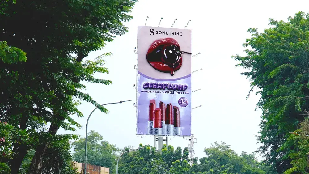
The Somethinc campaign at Billboard Kota Kasablanka, shown in the cover photo, follows a vertical reading order: logo at the very top, an oversized product visual in the middle, the product name beneath it, and the shade range across the lower third. The eye travels top to bottom and never meets a paragraph.
A tight crop on one subject beats a wide lifestyle image. Group shots, flat lays with a dozen products, or scenery with a small pack in the corner turn into texture at road distance. If you use talent, check that their usage rights cover outdoor media in Indonesia, not only digital.
Cut the long URL, the phone number, the terms and conditions, the feature list and the second hashtag. If legal requires a disclaimer, place it at the bottom at the minimum permitted size and accept that it will not be read from a moving car.
Year-end retail messaging
October is when many brands lock artwork for 11.11, 12.12, Christmas and New Year. Promo layouts tend to fill up with discount figures, date ranges, voucher codes and payment partner logos. On a billboard, choose the single most compelling number and make it big. Move the voucher code and partner logos to the digital channels people open after they have seen the board.
Type and contrast for long viewing distances
Use a sans-serif in medium to bold weight. Hairline fonts, scripts and decorative display faces blur together at distance, especially when the afternoon sun hits the panel. Sentence case reads faster than all caps for anything longer than three words.
Judge contrast against what sits behind the board, not only what is inside the artwork. Jakarta billboards are frequently seen against a pale white or light blue sky. A white or pastel design can lose its edges on a bright day, while a solid colour field or a dark border makes the panel read as one clear shape.
A quick check: convert the design to greyscale. If the logo and the line still stand out, contrast is fine. If red type on orange turns into grey on grey, change the pairing.
Day and night are two different viewings
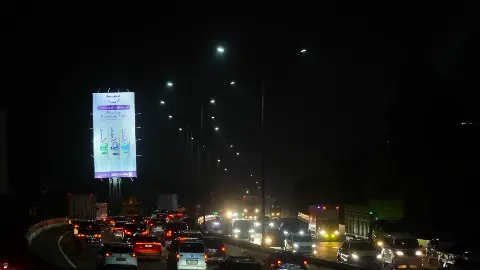
Static billboards are floodlit after dark, and colours under lamps rarely match colours under daylight. Large dark areas such as navy or black backgrounds can look flat and lose detail. Brands whose identity relies on a dark palette should leave enough room for light elements on top so the message survives after sunset.
Design for the direction of traffic
Facing direction decides who sees the board and in what state. Billboard Kota Kasablanka faces traffic heading towards Kuningan. Billboard TB Simatupang faces the flow towards Lebak Bulus, and Billboard Lebak Bulus faces traffic coming from Fatmawati. Billboard PGC faces towards Jl. Raya Bogor and Cililitan.
Congestion gives people more time to look, but do not design for the traffic jam. Off-peak, the same artwork has to work for cars moving at speed, so build for the fastest viewing condition. Jakarta roads also carry a large share of motorcycles, which means many viewers are balancing a bike while they look. Big, simple visuals beat clever wordplay that needs a second read, and wordplay rarely survives translation from a global English line anyway. Have the Bahasa Indonesia copy written by a local copywriter rather than translated.
One key visual across billboards and LED screens
Many campaigns we run combine static billboards with LED videotrons, and the formats vary. LED Senopati is a landscape 8 x 4 m screen, LED Slipi is 9 x 18 m and LED Dukuh Atas is 7 x 14 m. Plan portrait and landscape versions of the same key visual from day one instead of cropping one master for every site.
Video gives you motion and scene changes, but the readability rule is the same: the final frame should stand on its own as a static poster. Screen options are on our DOOH LED videotron page, and slot length is covered in our note on videotron ad slot length and frequency.
Test before it goes to print
Boardroom reviews on a large screen are misleading because everyone is seated and staring straight at it. Test in conditions closer to the road:
- Shrink the design on a phone until it is about one finger joint tall and hold it at arm's length. If brand and message do not register, it is too busy.
- Show it for two or three seconds to someone who has never seen it and ask what the brand and message were.
- Place the artwork on a real photo of the site. Ask our team for photos of the units you are considering so you can see how the panel competes with trees, buildings and sky.
- Run the greyscale check described above.
Get the technical specifications from the media owner before design starts: file dimensions, resolution, safe area and accepted formats. An 8 x 16 m panel and a 6 x 12 m panel need different proportions, and late revisions eat into production and installation time.
What drives cost and timing
Cost for a billboard campaign depends on the sites chosen, rental period, panel size, print production, installation, and the advertising tax and permits that apply to the content. Changing artwork mid-flight means another round of printing and installation, so it pays to finalise the design once. Permit requirements are handled locally; talk to us before assuming a timeline.
For a December flight, shortlist sites and brief the creative team now, since units facing the traffic you want may already be taken by the time artwork is ready. Our static inventory is listed on the Jakarta billboard page.
Send your draft artwork or campaign brief to the 8infiniooh team on WhatsApp +6282288108888 or through the contact page. We will suggest sites that match your target direction of traffic, share location photos for an artwork check, and prepare a quote.